Working with your Data: Easier and More Fun
April 12, 2012
Posted by Rebecca Shapley, Fusion Tables Team
Quick links
The Fusion Tables team has been a little quiet lately, but that’s just because we’ve been working hard on a whole bunch of new stuff that makes it easier to discover, manage and visualize data.
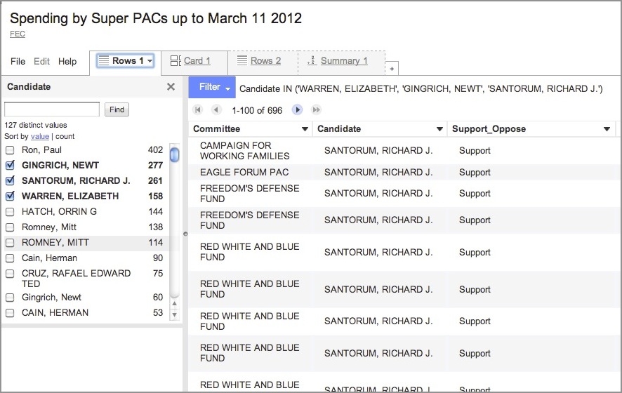
- A new way to look at your Fusion Table - Try the “Experimental” version of our Fusion Tables web application. The new design helps you explore and collaborate better on data. Faceted search make it easier to dive into a big data set and specify what you want to see. Multiple tabs let you experiment, trying different views of a table. And the new card layout lets you give a row of data your own custom layout. Give it a spin.
- More visualizations on lots of data - People love using Fusion Tables to put data on a map, but there are new visualizations available in our Experiment menu.Try the Zoomable Line chart. Playing with social network data? Try out the Network Graph visualization.
- New Fusion Tables API works great with javascript - Our new API, currently available to trusted testers, is more powerful and easier to use. The API can now return data in JSON so it’s easy to get data and manipulate it with javascript, right from the browser. You can now also RESTfully modify tables, templates and map styles. Want to try it out early and give your feedback? We’re looking for Trusted Testers... just join this group to become one.
- New open-source tools library welcomes your contributions - Fond of Fusion Tables Layer wizard? Just recently discovered the chart creator? These great point-n-click tools and more for working with Fusion Tables are now available in the Fusion Tables open source library. Please contribute your tools and enhancements!
-
Labels:
- Data Mining & Modeling
Quick links
×
❮
❯


