Making online learning even easier with a re-envisioned Course Builder
December 14, 2015
Posted by Adam Feldman, Product Manager and Pavel Simakov, Technical Lead, Course Builder Team
Quick links
(Cross-posted on the Google for Education blog)
The Course Builder team believes in enabling new and better ways to learn (for both the instructor and learner). Today's release of Course Builder v1.10 furthers these goals in three ways, by being easier to use, embeddable and applicable to more types of content.
Easier to use
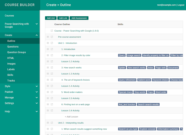
We took a step back and re-envisioned the menus and navigation of the administrative interface based on the steps instructors take as they create a course. These are designed to help you through the process of creating, styling, publishing and managing your courses. This re-imagined design gives a solid foundation for future versions of Course Builder.
 |
| A completely redesigned navigation simplifies content authoring and configuration. |
Embeddable assessment support
What if you want to use some of Course Builder’s features but already have an existing learning site? To help with these situations, Course Builder now supports embeddable assessments (graded questions and answers with an optional due date). Simply create your assessments in Course Builder, copy the JavaScript snippet and paste it on any site. Your users will be able to complete the assessments from the comfort of your existing site and you’ll be able to benefit from Course Builder’s per-question feedback, auto-grading and analytics with just two short lines of code that are automatically generated for you.
We started with embeddable assessments because evaluation is so important to learning, but we don’t plan to stop there. Watch for additional embeddable components in the future.
Applicable to more types of content
Many types of online learning content, like tutorials, exercises and documentation, are a lot like online courses. For instance, they might involve presenting content to users, having them do exercises or assessments and allowing them to stop and return later. Yet, you might not think of them as traditional courses.
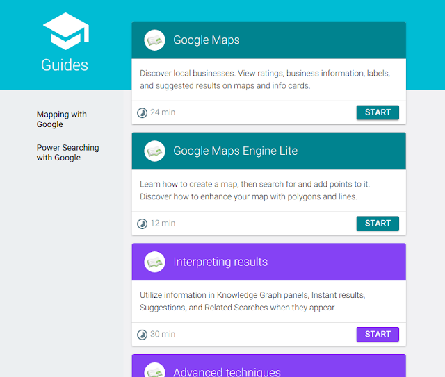
To make Course Builder a better fit for a broader set of online content, we’ve added a new “guides” experience. Guides are a new way for students to browse and consume your content. Compared to typical online courses -- which can enforce a strict linear path (from unit 1 to unit 2, etc.) -- guides present your content as a non-numbered list. Users are free to enter and exit in any order. It also allows you to show the content for many courses together.
You could imagine each guide being a documentation page or tutorial section. Guides also work with any existing Course Builder units and can be made available by simply enabling that feature in the dashboard. Here are a couple of our courses, when viewed as guides:
Within each guide, the user is guided through the steps, which could be portions of a docs page or lessons in a unit, as in this example from the “Power Searching with Google” sample course:
By letting users jump in and out of the content as they like, guides are ideally suited to the on-the-go learner and look great on phones and tablets. It’s our first foray into responsive mobile design... but it won’t be our last.
Guides currently support public courses, but we’ll be adding registration, enhanced statefulness and interface customization, as well as elements of dynamic learning (think of a personalized list of guides).
This release has focused on making Course Builder easier to use and more relevant. It sets up the framework to give future features a natural home. It adds embeddable assessments to make Course Builder useful in more places. And it introduces guides, a new, less linear format for consuming content.
For a full list of features, see the release notes, and let us know what you think. Keep on learning!
-
Labels:
- Education Innovation
Quick links
×
❮
❯


