Unlocking the power of time-series data with multimodal models
November 25, 2024
Mathias Bellaiche, Data Scientist, and Marc Wilson, Software Engineer, Google Research
We compare the performance of multimodal models on the understanding of time-series data when presented visually as plots compared to numerical values. We find significant performance improvements when presented with plots on tasks like fall detection.
Quick links
The successful application of machine learning to understand the behavior of complex real-world systems from healthcare to climate requires robust methods for processing time series data. This type of data is made up of streams of values that change over time, and can represent topics as varied as a patient’s ECG signal in the ICU or a storm system moving across the Earth.
Highly capable multimodal foundation models, such as Gemini Pro, have recently burst onto the scene and are able to reason not only about text, like the large language models (LLMs) that preceded them, but also about other modalities of input, including images. These new models are powerful in their abilities to consume and understand different kinds of data for real-world use cases, such as demonstrating expert medical knowledge or answering physics questions, but haven’t yet been leveraged to make sense of time-series data at scale, despite the clear importance of this type of data. As chat interfaces mature generally across industries and data modalities, products will need the ability to interrogate time series data via natural language to meet user needs. When working with time series data, previous attempts to improve performance of LLMs have included sophisticated prompt tuning and engineering or training a domain specific encoder.
Today we present work from our recent paper, “Plots Unlock Time-Series Understanding in Multimodal Models”, in which we show that for multimodal models, much like for humans, it is easier to make sense of the data visually by looking at plots of the data rather than sifting through the raw time-series values themselves. Importantly, we show that this does not require any expensive additional training, and instead relies on the native multimodal capabilities of these foundation models. Compared to only using a text format for prompting a multimodal model, we demonstrate that using plots of the time series data can increase performance on classification tasks up to 120%.

A conceptual summary of our experiments in which we test a multimodal foundation model’s ability to reason about a time series either with the list of numbers that make up the series, or the plot of the numbers. One example case we considered was using wearable signals to identify falls.
Investigation overview
We investigated the hypothesis that multimodal models understand time-series data better through their vision encoders than through the textual representation of long arrays of floating point numbers. We tested both synthetic tasks that we devised to allow us to probe specific types of reasoning, and real-world tasks that contain representatively noisy data whose analysis is important for advancing digital health. For each task we ran experiments using a text method and a plot method to prompt the model with the time-series data. The text method used the raw time-series data to create a series of numbers that were used directly to prompt the model. The plot method took the raw time-series data, created a visual plot of that data and then used an image of the plot to prompt the model. To show that this generalizes across different foundation models, we performed experiments on both small and large models of two best-of-class families of frontier models: Gemini Pro 1.5 and GPT4o, and two smaller models Gemini Flash 1.5 and GPT4o-mini.
Real world digital health tasks
We tested our approach on anonymized real world data collected from research study participants through mobile or wearable devices for health-relevant tasks.
Detecting falls
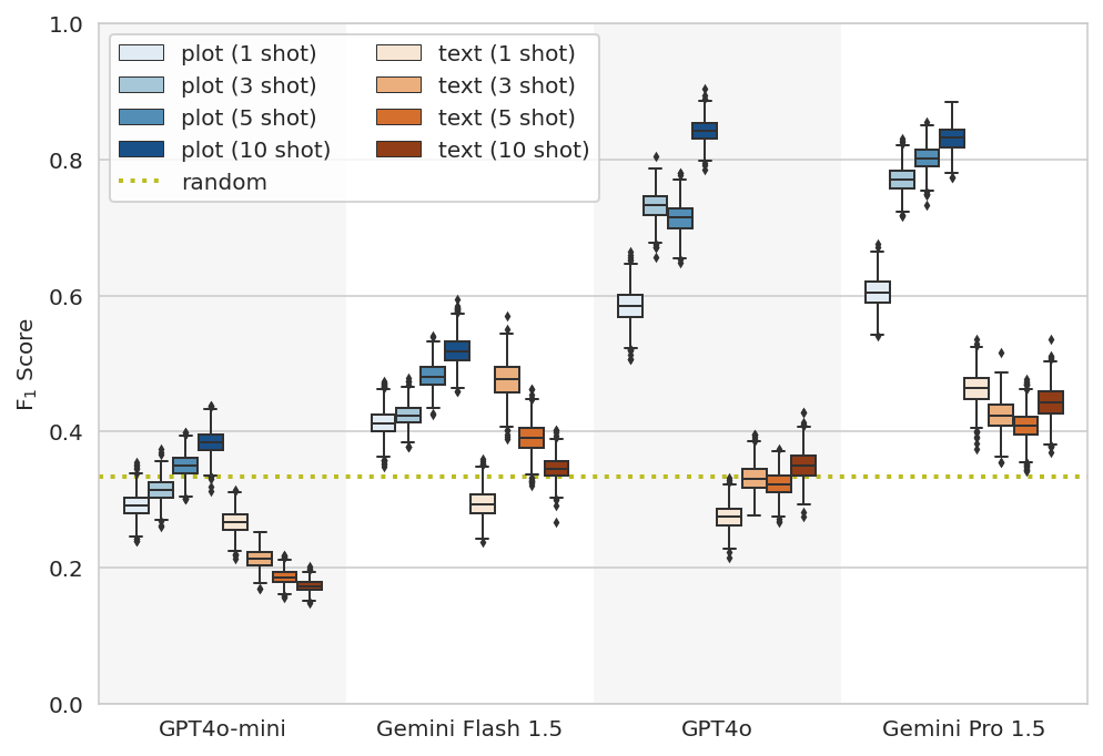
One such task that we explored was using a publicly available IMU (Inertial Measurement Unit) dataset curated and labeled for fall detection, since falls are an important health risk, especially amongst the older and more vulnerable people. IMU sensors report six dimensions of acceleration and angular velocity data sampled at over 100Hz and are commonly found in today's smartphones and smartwatches. In this task, we instruct the models to classify the sensor data into normal daily living without a fall, near falls, or actual falls. A near fall is characterized as a loss of balance that would result in a fall if sufficient balance recovery maneuvers are not executed. Identifying when a near fall is occurring is important, since older adults may not recognize it as one; near falls may also predict the risk of true falls. This particular dataset was deliberately curated to include examples where the user had a near fall, such as a recovering from a slip without actually falling, making it more challenging to determine whether the user actually had a fall.
This task was structured as a few-shot task, where the model was shown a number of IMU time-series examples for each outcome before being asked to classify an IMU time-series example that it had not seen before.
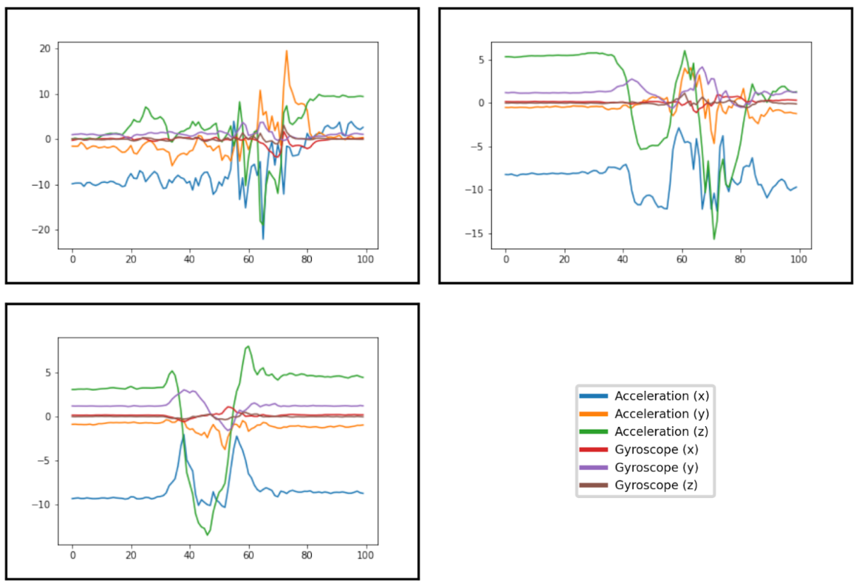
Plots of example entries from the fall detection dataset that were correctly categorized by Gemini Pro (10-shot). Top-Left: Fall. Top-Right: Near Fall. Bottom-Left: Daily living without a fall. Examples were collected with an IMU sensor at the waist and each of the three acceleration and gyroscope axes were plotted as a different series on the same plot. Though the labels were omitted for ingestion by the model, the x-axis plots time and the y-axis plots both acceleration and angular velocity.
Overall the plot method outperformed the text method on this task and, in general, improved as more few-shot examples were provided. This indicated that the models were able to extract additional information from the few-shot examples when they were presented as plots.
Recognizing physical activity
We also used IMU data for a different task, in which we tested the models’ abilities to discriminate the type of physical activity being performed by a user between sitting, standing, using stairs, walking or biking. This kind of activity recognition is regularly used in fitness and wellbeing products that users rely on to track and improve their physical health. The publicly available dataset we used was designed to collect IMU data from a variety of different devices such as phones and smartwatches, with this heterogeneity of data sources increasing the difficulty of the classification task.
We presented this as a few-shot prompt to the models and, like the fall detection task, we find that the plot-based approach outperforms the text-based method. Again increasing the number of few-shot examples generally increased the plot performance in most models.
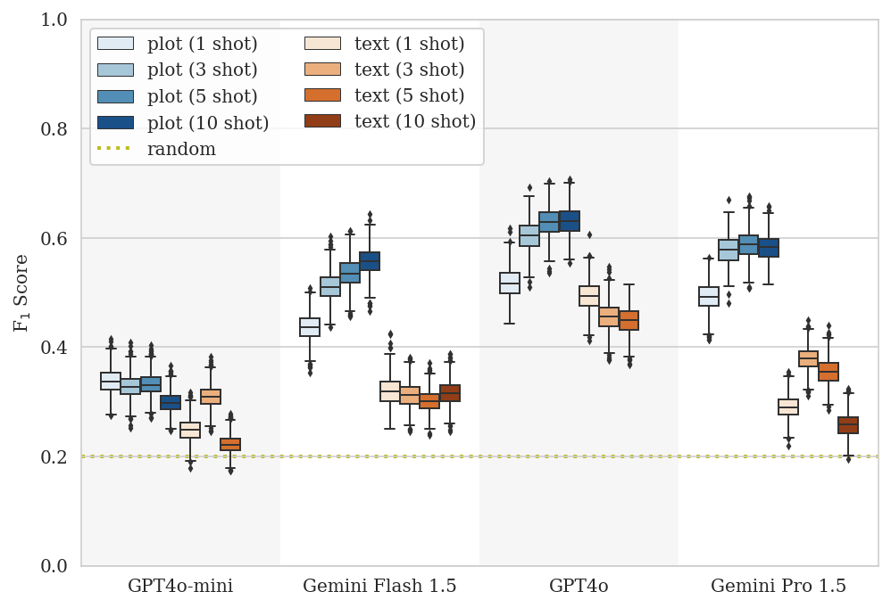
A boxplot showing the performance of the plot (blue) and text (orange) methods on the activity recognition task.
Synthetic tasks
Having shown that plots improve model performance in contexts that are relevant to digital health, we also investigated model performance in synthetic experiments of our own design. We did this to probe performance generally on tasks of increasing difficulty and reasoning sophistication, ranging from naming the pattern being plotted to multiple choice questions a university calculus student might encounter.
The simplest synthetic task we used was functional form identification, where the model had to classify a series of data points into the type of underlying function that created it, such as a linear or quadratic. With this relatively simple task the median classification accuracy of the plot method was up to 120% better than the text method, indicating that when presented visually as a plot, the multimodal foundation models could more easily understand the overall trend and discern the underlying function than when they were just provided the raw data.
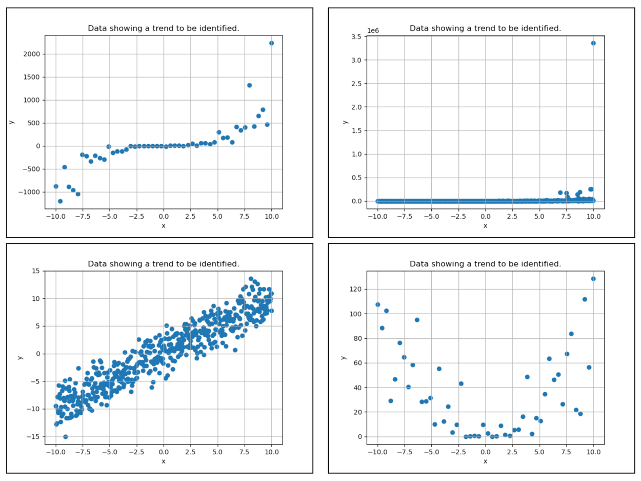
Four example plots used for functional form identification. Clockwise from Top-Left: Cubic, exponential, quadratic, linear.
A harder task involved synthetic data series where the data was clustered in 1 to 9 discrete clusters and the model was asked to count the number of clusters in the data. The plot method had a 55-85% lower mean absolute error than the text method.
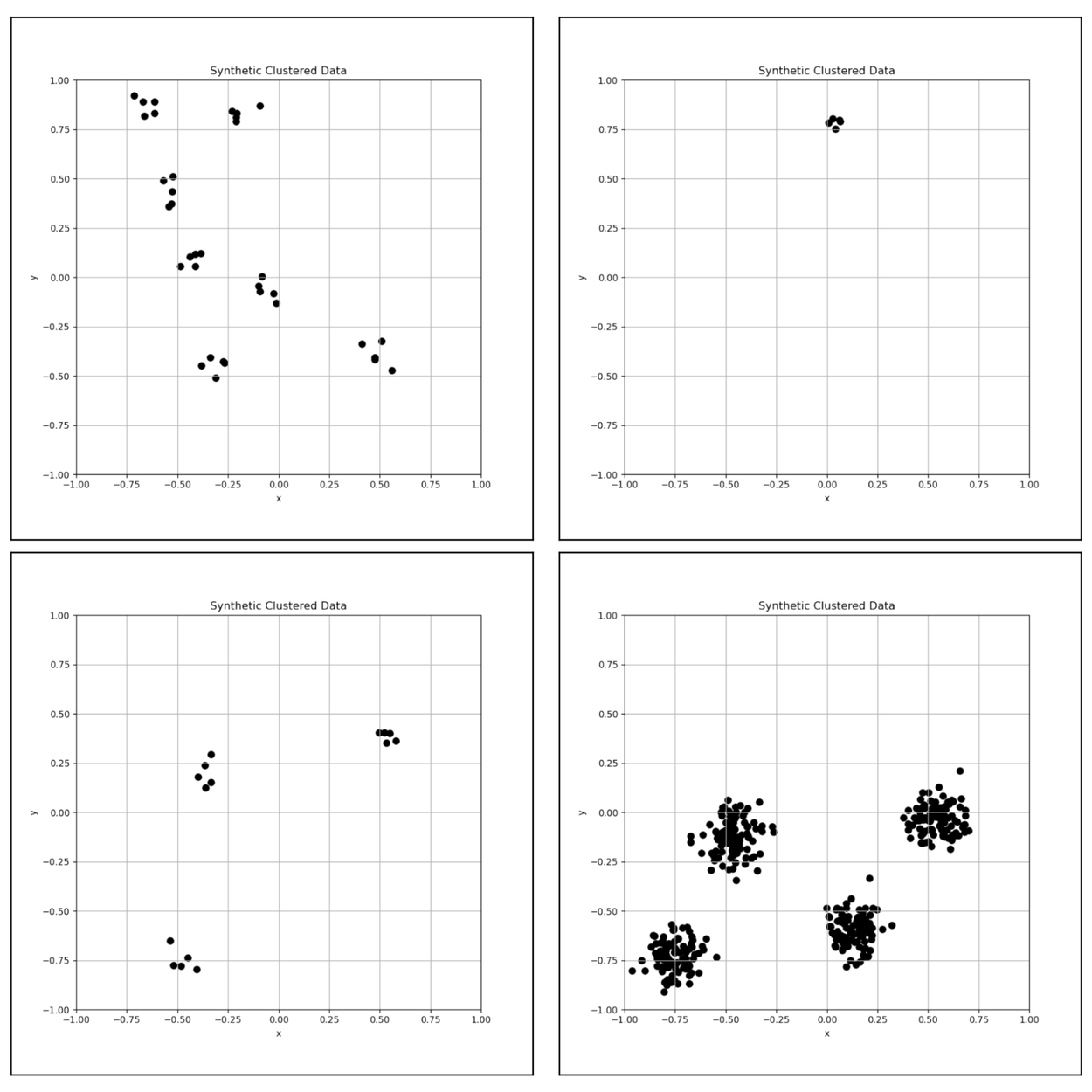
Four example plots used for 2D cluster counting. Clockwise from Top-Left: 7, 1, 4 and 3 clusters.
Additional synthetic tasks we tested include classifying linear correlations and identifying derivatives, which also generally showed that the plot performance was better than, or at least as good as, the text performance.
The art of the chart
Having shown that for time-series data, the reasoning power of these foundation models are best leveraged through plots, we also investigated whether the models preferred any specific style of plot. We tried many different aesthetic choices such as changing the color scheme, marker size and axis display, but in the end found that there wasn’t a strong dependence of the results on these choices.

A sample of the function identification examples used to show the robust plot performance over a range of plotting styles and configurations.
A picture is worth 1,000 words
Beyond the performance gain of the models ingesting plots over text, we also found that using plots made more efficient use of the limited context window of the models we studied. The fundamental reason for this is the mechanism in which multimodal models ingest either textual or visual information – when presented as numeric strings, time series data must be split into many granular tokens that the model ingests, while a plotted image is more efficiently represented with fewer tokens. As a result, plotting a time-series made more efficient use of available model context lengths, especially in cases where passing the full textual form of a time-series would generate more tokens than the model can ingest.
We also found that the cost of reasoning about a plotted time-series could be up to 10x cheaper than reasoning about its textual representation, as model API cost increases with the number of input tokens.
Conclusion
Our results show that plotting as an approach amplifies the capabilities of multimodal models currently available to consumers to make sense of complicated time-series data. Our work sets the stage for increasing the power of tools and assistants powered by multimodal models to incorporate time-series data for end-user benefit.
Acknowledgements
We would like to acknowledge Mayank Daswani for leading this work and all the collaborators across Google including Desislav Ivanov, Mikhail Papkov, Eva Schnider, Jing Tang, Kay Lamerigts, Gabriela Botea, Michael Sanchez, Yojan Patel, Shruthi Prabhakara, Shravya Shetty and Umesh Telang for contributing to the research and to Sebastien Baur, Yun Liu and Diego Ardila for their valuable input. We also want to thank Tiya Tiyasirichokchai for designing the graphic for this post and Dr. Stephen Robinovitch for granting permission to include plots of examples from the IMU Fall Detection dataset.
