Turbo, An Improved Rainbow Colormap for Visualization

August 20, 2019

Posted by Anton Mikhailov, Senior Software Engineer, Daydream


False color maps show up in many applications in computer vision and machine learning, from visualizing depth images to more abstract uses, such as image differencing. Colorizing images helps the human visual system pick out detail, estimate quantitative values, and notice patterns in data in a more intuitive fashion. However, the choice of color map can have a significant impact on a given task. For example, interpretation of “rainbow maps” have been linked to lower accuracy in mission critical applications, such as medical imaging. Still, in many applications, “rainbow maps” are preferred since they show more detail (at the expense of accuracy) and allow for quicker visual assessment.
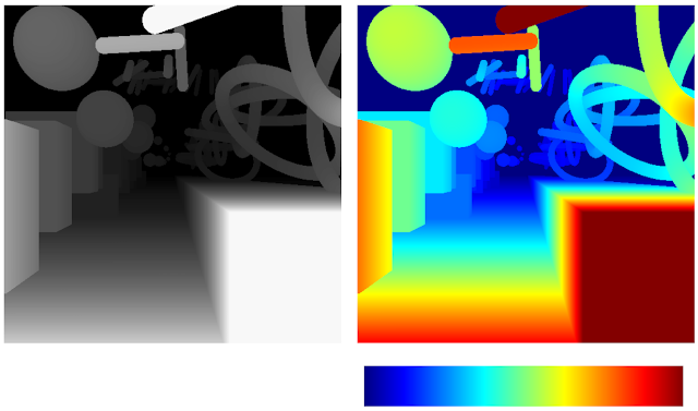
Side-by-side comparison of a complex 3D scene rendered in grayscale depth map versus a vibrant color-coded heatmap.
Left: Disparity image displayed as greyscale. Right: The commonly used Jet rainbow map being used to create a false color image.
One of the most commonly used color mapping algorithms in computer vision applications is Jet, which is high contrast, making it useful for accentuating even weakly distinguished image features. However, if you look at the color map gradient, one can see distinct “bands” of color, most notably in the cyan and yellow regions. This causes sharp transitions when the map is applied to images, which are misleading when the underlying data is actually smoothly varying. Because the rate at which the color changes ‘perceptually’ is not constant, Jet is not perceptually uniform. These effects are even more pronounced for users that are color blind, to the point of making the map ambiguous:
Abstract 3D rendering featuring glowing yellow and white geometric shapes floating above an illuminated corridor pathway.
The above image with simulated Protanopia
Today there are many modern alternatives that are uniform and color blind accessible, such as Viridis or Inferno from matplotlib. While these linear lightness maps solve many important issues with Jet, their constraints may make them suboptimal for day to day tasks where the requirements are not as stringent.
Depth map of a cluttered 3D scene using a viridis colormap where yellow is close and purple is distant. Depth map rendering a 3D scene using an inferno colormap ranging from bright yellow foregrounds to black backgrounds.
ViridisInferno
Today we are happy to introduce Turbo, a new colormap that has the desirable properties of Jet while also addressing some of its shortcomings, such as false detail, banding and color blindness ambiguity. Turbo was hand-crafted and fine-tuned to be effective for a variety of visualization tasks. You can find the color map data and usage instructions for Python here and C/C++ here, as well as a polynomial approximation here.

Development
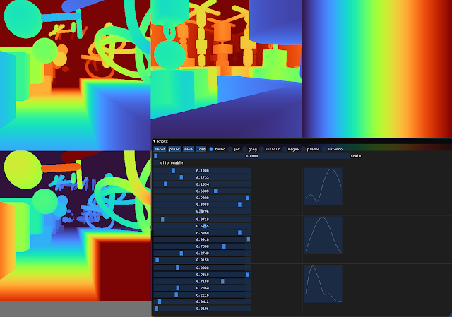
To create the Turbo color map, we created a simple interface that allowed us to interactively adjust the sRGB curves using a 7-knot cubic spline, while comparing the result on a selection of sample images as well as other well known color maps.
Interface displaying various depth map colormap renderings alongside a control panel for adjusting clipping and scale parameters.
Screenshot of the interface used to create and tune Turbo.
This approach provides control while keeping the curve C2 continuous. The resulting color map is not “perceptually linear” in the quantitative sense, but it is more smooth than Jet, without introducing false detail.

Smooth horizontal color gradient transitioning seamlessly from dark violet on the left to deep red on the right.
Turbo
Horizontal gradient spectrum blending seamlessly from deep blue through cyan, green, and yellow into dark red.
Jet
Comparison with Common Color Maps
Viridis is a linear color map that is generally recommended when false color is needed because it is pleasant to the eye and it fixes most issues with Jet. Inferno has the same linear properties of Viridis, but is higher contrast, making it better for picking out detail. However, some feel that it can be harsh on the eyes. While this isn’t a concern for publishing, it does affect people’s choice when they must spend extended periods examining visualizations.
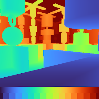
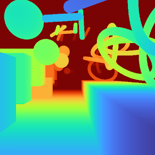
Depth map visualizing a 3D environment using a turbo colormap transitioning from red foregrounds to purple backgrounds. Depth map rendering abstract 3D shapes using a jet colormap where red is closest and dark blue is furthest.
TurboJet
Depth map rendering a complex 3D environment using a viridis colormap transitioning from yellow foregrounds to purple backgrounds. Depth map illustrating a 3D scene utilizing a magma colormap that transitions from bright yellow to dark purple.
ViridisInferno
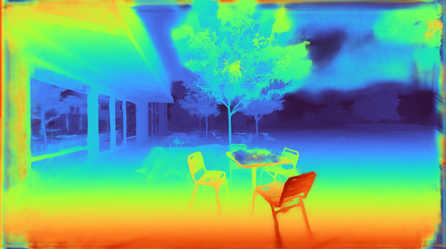
Because of rapid color and lightness changes, Jet accentuates detail in the background that is less apparent with Viridis and even Inferno. Depending on the data, some detail may be lost entirely to the naked eye. The background in the following images is barely distinguishable with Inferno (which is already punchier than Viridis), but clear with Turbo.
Thermal imaging view of an outdoor patio setting featuring a table, chairs, and trees against a building.Thermal imaging view of an outdoor patio setting featuring a table, chairs, and surrounding trees.
InfernoTurbo
Turbo mimics the lightness profile of Jet, going from low to high back down to low, without banding. As such, its lightness slope is generally double that of Viridis, allowing subtle changes to be more easily seen. This is a valuable feature, since it greatly enhances detail when color can be used to disambiguate the low and high ends.
Smooth black parabolic curve plotted against a background smoothly transitioning horizontally from dark grey to light grey.Irregular black curve plotted across a background transitioning horizontally from dark grey through white to dark grey.
TurboJet
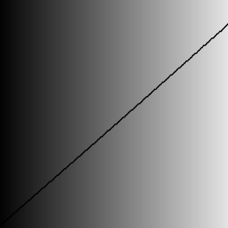
Straight diagonal black line stretching across a background that smoothly transitions from dark grey to white horizontally.Straight diagonal black line plotted across a background transitioning horizontally from black through dark grey to white.
ViridisInferno
Lightness plots generated by converting the sRGB values to CIECAM02-UCS and displaying the lightness value (J) in greyscale. The black line traces the lightness value from the low end of the color map (left) to the high end (right).
The Viridis and Inferno plots are linear, with Inferno exhibiting a higher slope and over a broader range. Jet’s plot is erratic and peaky, and banding can be seen clearly even in the grayscale image. Turbo has a similar asymmetric profile to Jet with the lows darker than the highs.This is intentional, to make cases where low values appear next to high values more distinct. The curvature in the lower region is also different from the higher region, due to the way blues are perceived in comparison to reds.

Although this low-high-low curve increases detail, it comes at the cost of lightness ambiguity. When rendered in grayscale, the coloration will be ambiguous, since some of the lower values will look identical to higher values. Consequently, Turbo is inappropriate for grayscale printing and for people with the rare case of achromatopsia.

Semantic Layers
When examining disparity maps, it is often desirable to compare values on different sides of the image at a glance. This task is much easier when values can be mentally mapped to a distinct semantic color, such as red or blue. Thus, having more colors helps the estimation ease and accuracy.
Abstract 3D composition of glowing floating spheres and curving tubes suspended above an illuminated rectangular corridor.Vibrant 3D digital art featuring glowing geometric spheres, cylinders, and intertwining rings floating above a solid pathway.
TurboJet
Abstract 3D rendering featuring suspended teal and blue geometric shapes above a glowing yellow central pathway.Colorful 3D digital art displaying floating purple and orange geometric shapes above a bright, illuminated pathway.
ViridisInferno
With Jet and Turbo, it’s easy to see which objects on the left of the frame are at the same depth as objects on the right, even though there is a visual gap in the middle. For example, you can easily spot which sphere on the left is at the same depth as the ring on the right. This is much harder to determine using Viridis or Inferno, which have far fewer distinct colors. Compared to Jet, Turbo is also much more smooth and has no “false layers” due to banding. You can see this improvement more clearly if the incoming values are quantized:
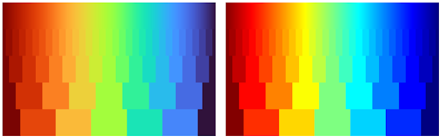
Two side-by-side color gradient charts displaying stepped transitions from dark red through yellow and green to blue.
Left: Quantized Turbo colormap. Up to 33 quantized colors remain distinguishable and smooth in both lightness and hue change. Right: Quantized Jet color map. Many neighboring colors appear the same; Yellow and Cyan colors appear brighter than the rest.
Quick Judging
When doing a quick comparison of two images, it’s much easier to judge the differences in color than in lightness (because our attention system prioritizes hue). For example, imagine we have an output image from a depth estimation algorithm beside the ground truth. With Turbo it’s easy to discern whether or not the two are in agreement and which regions may disagree.
Depth map of a cluttered 3D scene utilizing a viridis colormap where yellow is close and dark blue is distant.Depth map rendering abstract 3D shapes using a viridis colormap, transitioning from yellow foregrounds to dark purple backgrounds.
“Output” Viridis“Ground Truth” Viridis
Depth map illustrating a 3D scene with a turbo colormap transitioning from dark red foregrounds to blue backgrounds.Depth map visualizing abstract 3D geometry using a turbo colormap, where dark red indicates proximity and dark purple indicates distance.
“Output” Turbo“Ground Truth” Turbo
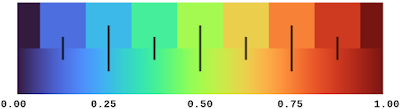
In addition, it is easy to estimate quantitative values, since they map to distinguishable and memorable colors.
Color palette diagram displaying a horizontal turbo colormap gradient transitioning from dark purple through blue, green, and yellow into dark red.
Diverging Map Use Cases
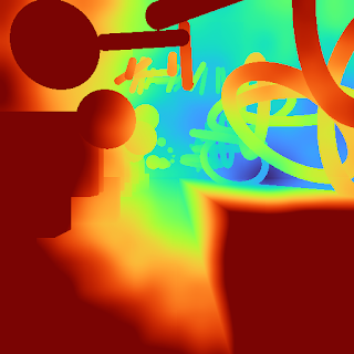
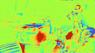
Although the Turbo color map was designed for sequential use (i.e., values [0-1]), it can be used as a diverging colormap as well, as is needed in difference images, for example. When used this way, zero is green, negative values are shades of blue, and positive values are shades of red. Note, however, that the negative minimum is darker than the positive maximum, so it is not truly balanced.
Depth map rendering a cluttered room using a winter colormap transitioning from teal foregrounds to dark blue backgrounds.Depth map of a complex 3D interior using a winter colormap, where bright green indicates proximity and dark blue indicates distance.
"Ground Truth" disparity imageEstimated disparity image
Highly stylized false-color depth map rendering a room using a custom colormap heavily biased towards vivid neon greens and reds.
Difference Image (ground truth - estimated disparity image), visualized with Turbo
Accessibility for Color Blindness
We tested Turbo using a color blindness simulator and found that for all conditions except Achromatopsia (total color blindness), the map remains distinguishable and smooth. In the case of Achromatopsia, the low and high ends are ambiguous. Since the condition affects 1 in 30,000 individuals (or 0.00003%), Turbo should be usable by 99.997% of the population.
Depth map illustrating a dense architectural interior using a turbo colormap transitioning from red backgrounds to blue foregrounds.
Test Image
Depth map visualizing an intricate 3D architectural space using a custom colormap transitioning from brown backgrounds to blue foregrounds.Depth map rendering an intricate 3D architectural space using a custom colormap transitioning from dark green backgrounds to blue foregrounds.
ProtanomalyProtanopia
Depth map illustrating a dense architectural interior utilizing a custom colormap transitioning from dark orange to blue foregrounds.Depth map visualizing complex 3D geometry using a custom colormap transitioning from dark olive backgrounds to light blue foregrounds.
DeuteranomalyDeuteranopia
Depth map rendering an intricate 3D architectural space using a custom colormap transitioning from dark red backgrounds to blue foregrounds.Depth map of a cluttered 3D architectural space utilizing a custom colormap transitioning from dark red backgrounds to cyan foregrounds.
TritanomalyTritanopia
Depth map illustrating a complex 3D geometric interior using a custom colormap transitioning from dark maroon to light blue foregrounds. Depth map visualizing an intricate 3D architectural scene rendered entirely in grayscale, transitioning from black backgrounds to white foregrounds.
Blue cone monochromacyAchromatopsia
Conclusion
Turbo is a slot-in replacement for Jet, and is intended for day-to-day tasks where perceptual uniformity is not critical, but one still wants a high contrast, smooth visualization of the underlying data. It can be used as a sequential as well as a diverging map, making it a good all-around map to have in the toolbox. You can find the color map data and usage instructions for Python here and for C/C++ here. There is also a polynomial approximation here, for cases where a look-up table may not be desirable.Our team uses it for visualizing disparity maps, error maps, and various other scalar quantities, and we hope you’ll find it useful as well.

Acknowledgements
Ambrus Csaszar stared at many color ramps with me in order to pick the right tradeoffs between uniformity and detail accentuation. Christian Haene integrated the map into our team’s tools, which caused wide usage and thus spurred further improvements. Matthias Kramm and Ruofei Du came up with closed form approximations.
×
×